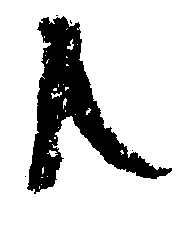
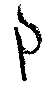
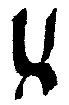
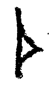
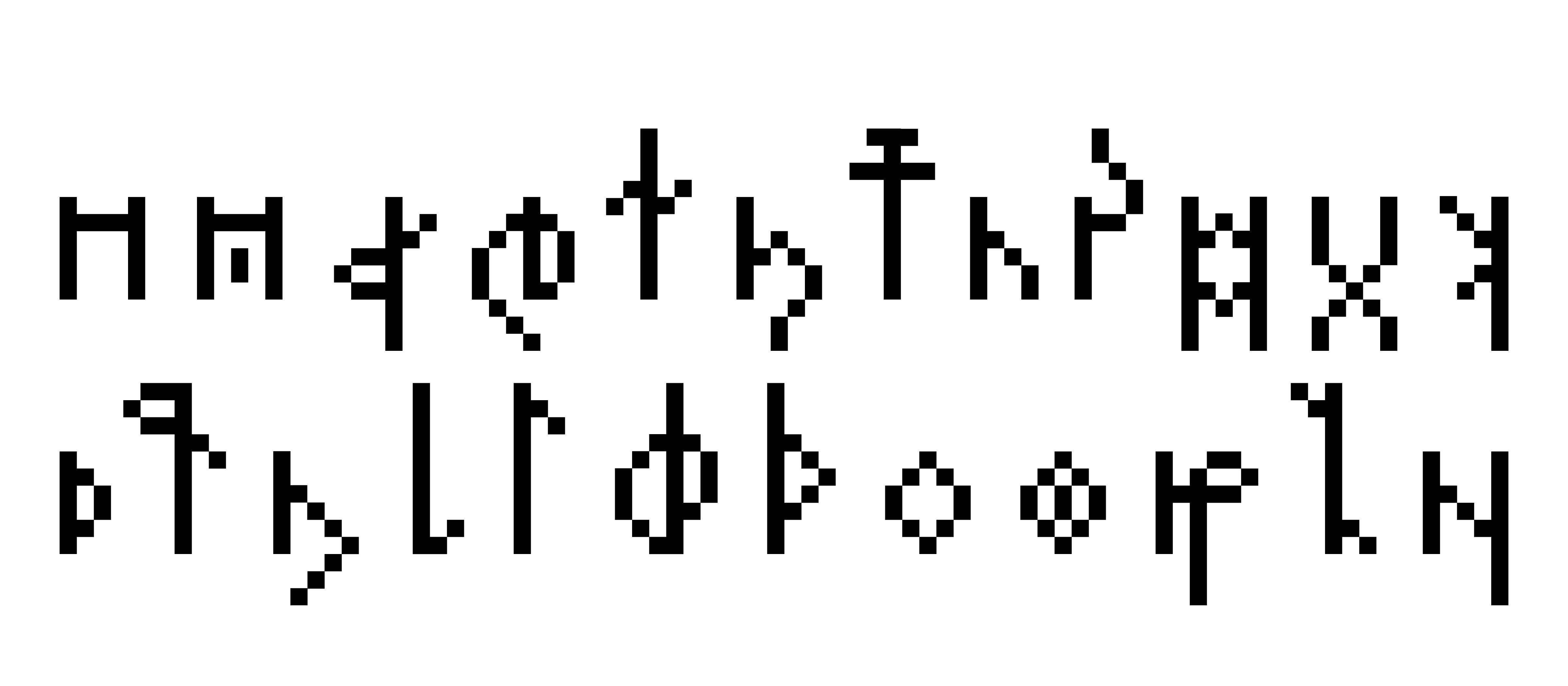
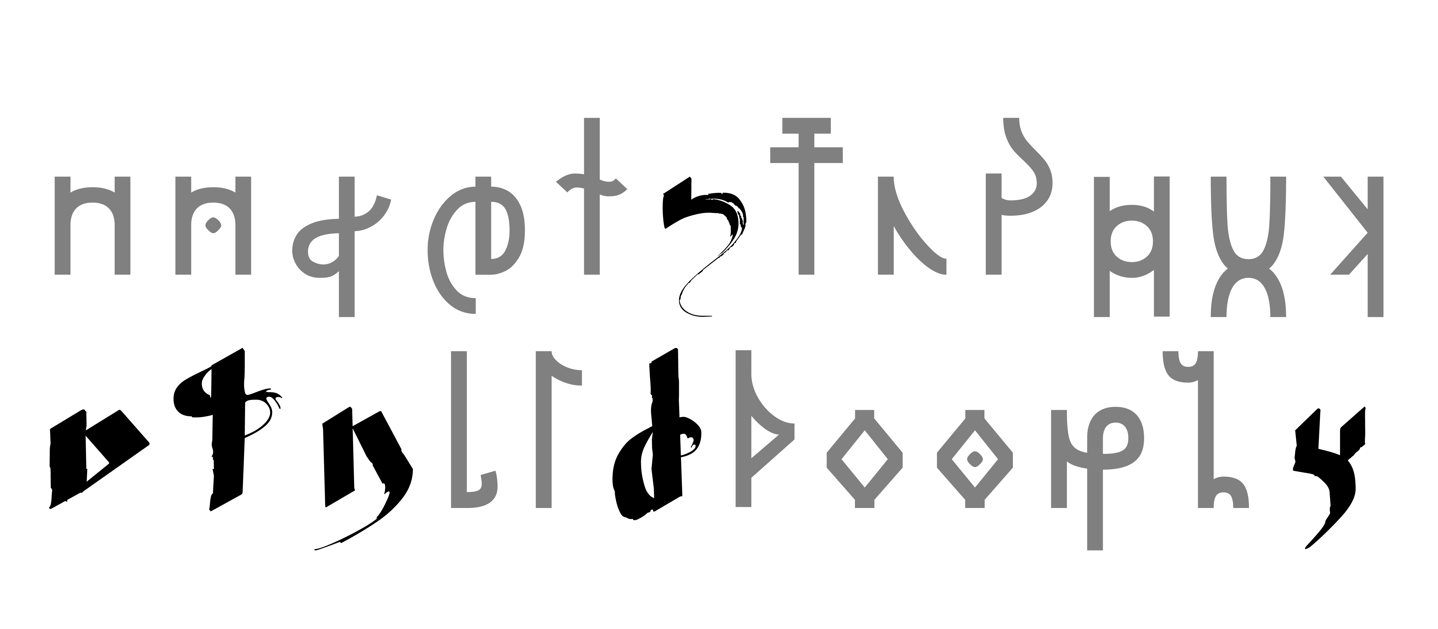
Gätuhil Sans
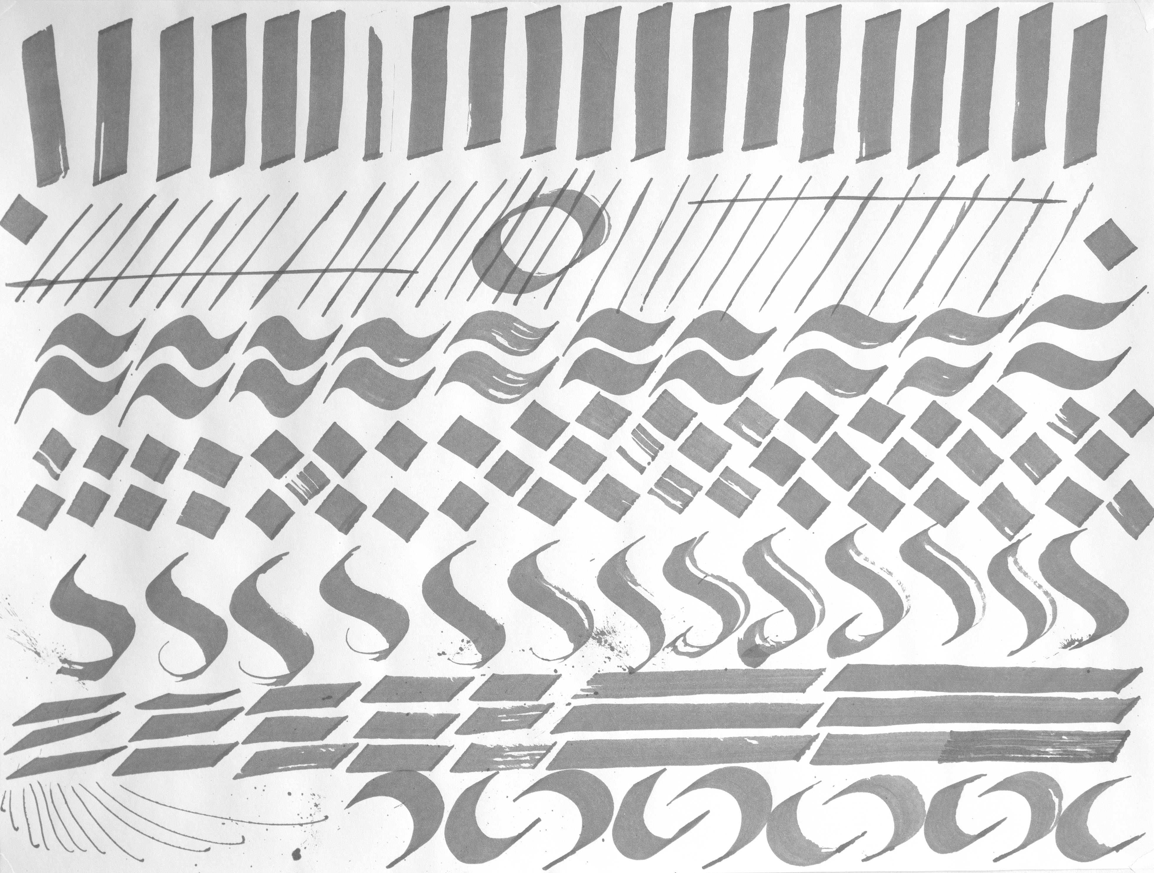
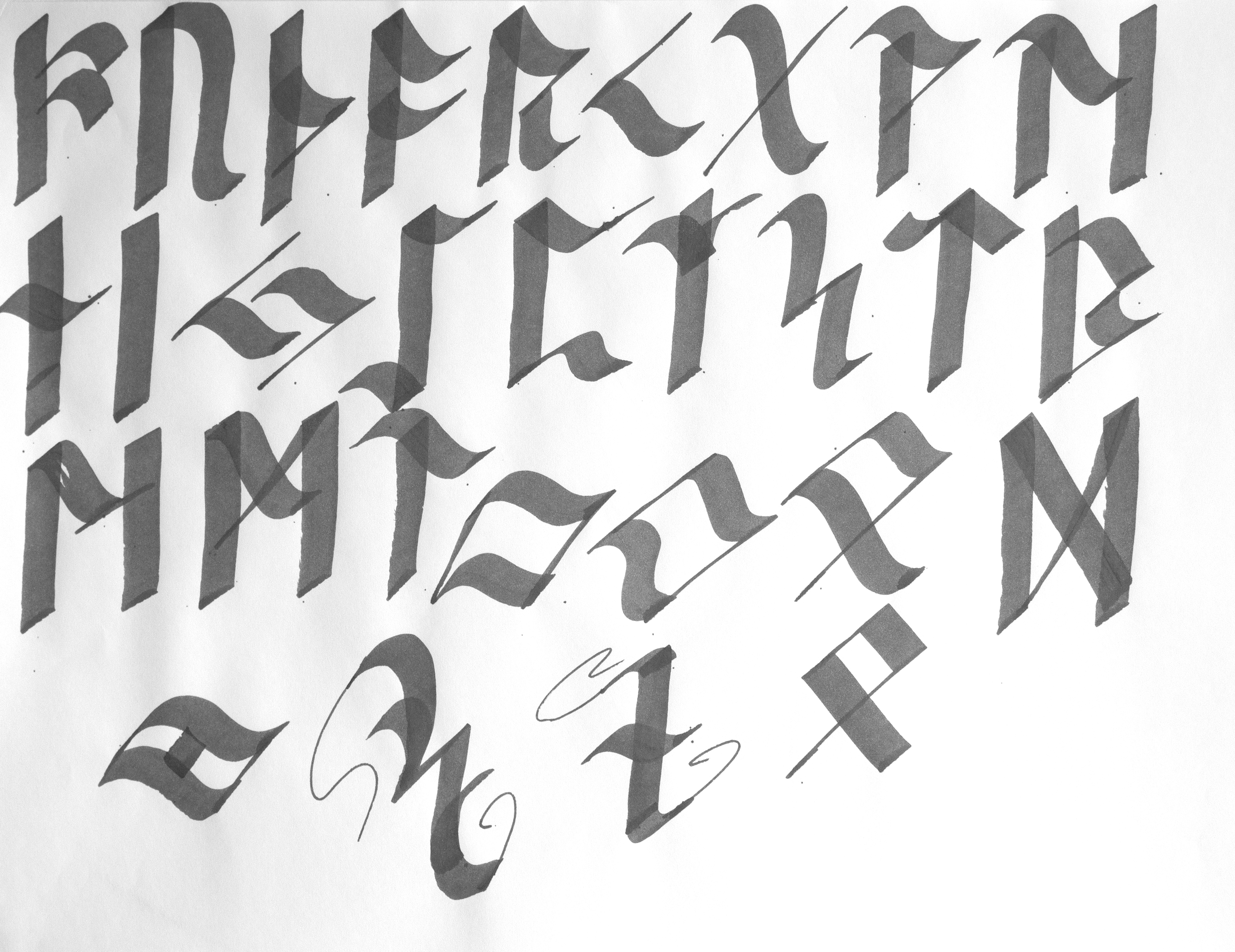
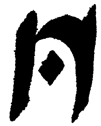
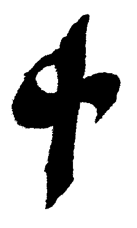
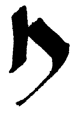
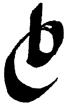
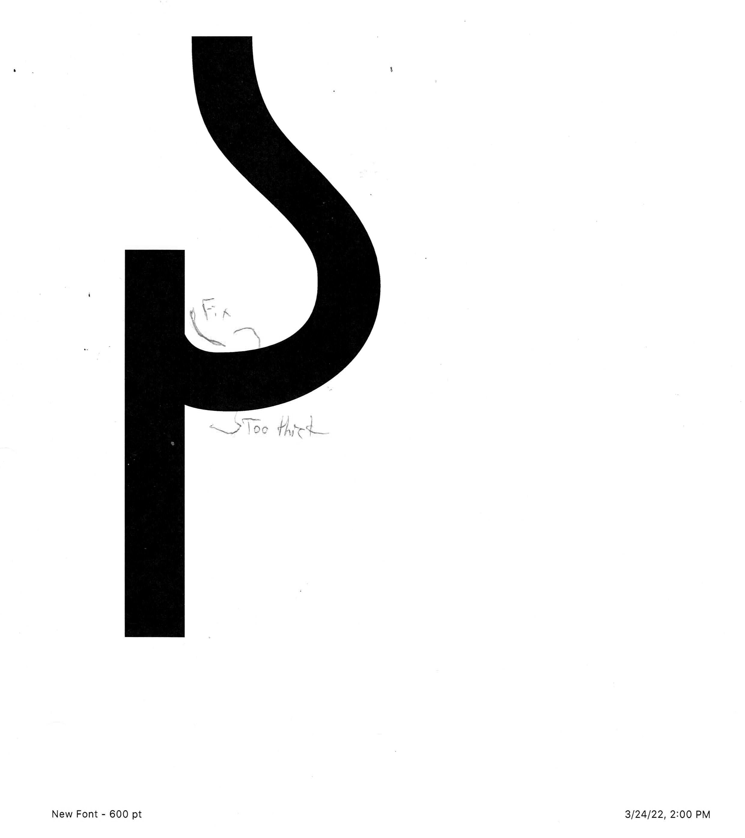
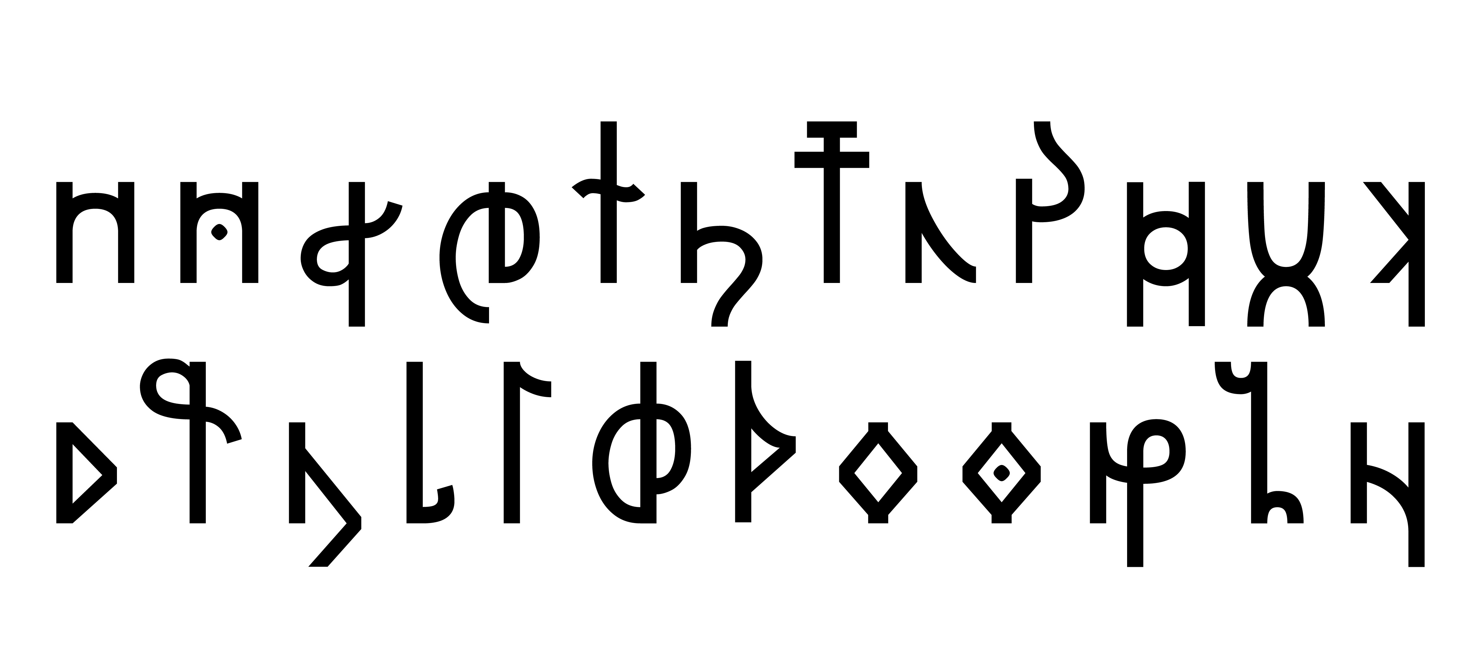
Type Design, 2022After building the phonetic groundwork of the language, the development of a writing system, as well as the subsequent typeface, was possible. I decided to name the writing system Gätuhil, combining the word Gäta (hand) and Hil (speach).
Given the inspirations from Germanic and Celtic languages in the spoken language, it seemed fitting to research Germanic Runes as a starting point. Research into the evolution of the Latin Alphabet then created a prompt of “How might Runes change if they went through a similar evolution?”. I decided Gätuhil should be an alphabet (as opposed to a syllabary, abjad, abugida, etc.) partially because it would be easier to create as a font, but also because it would then share more similarities typographically to the Latin Alphabet.
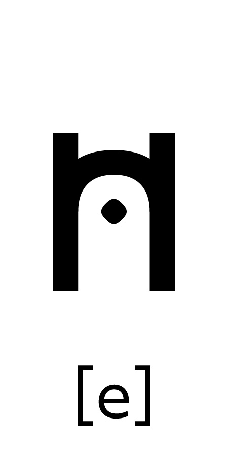
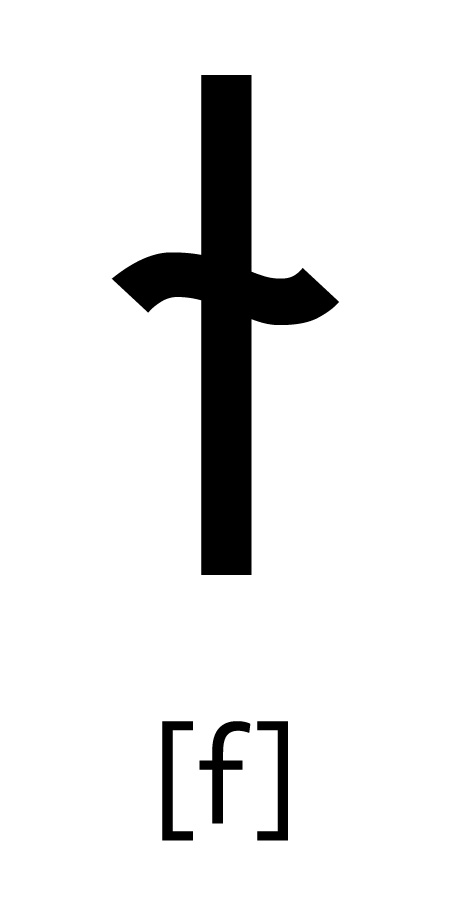
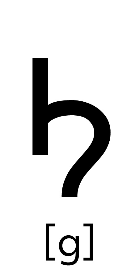
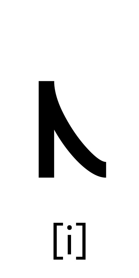
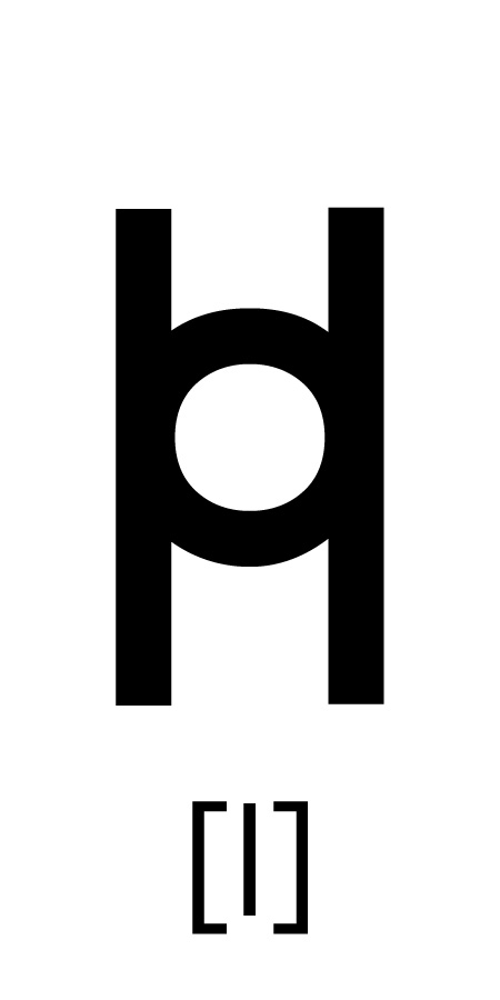
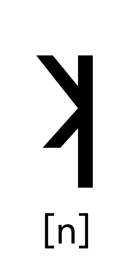
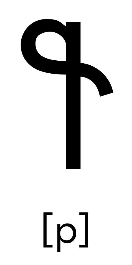
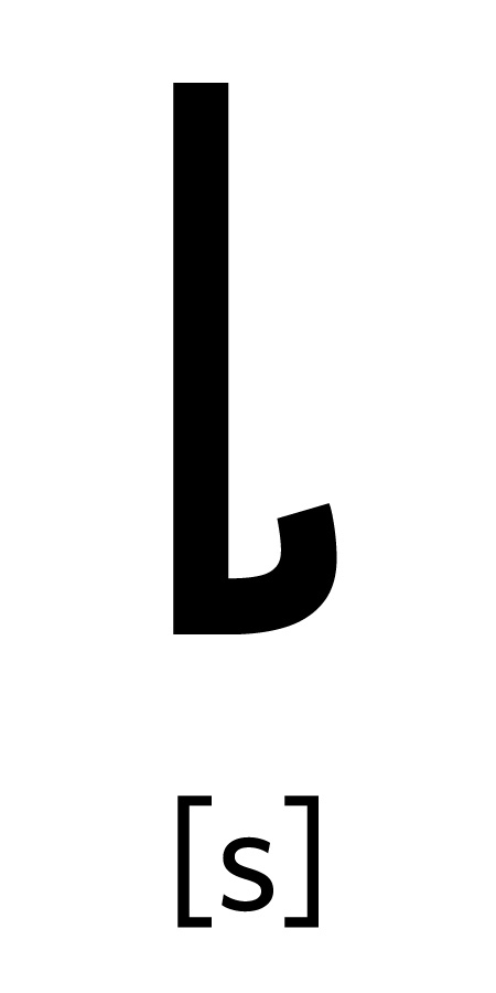
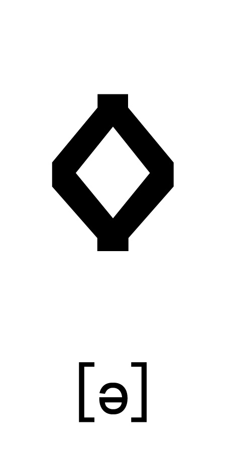
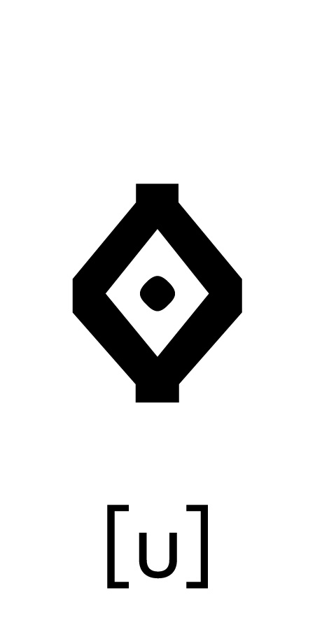
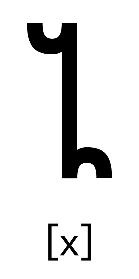
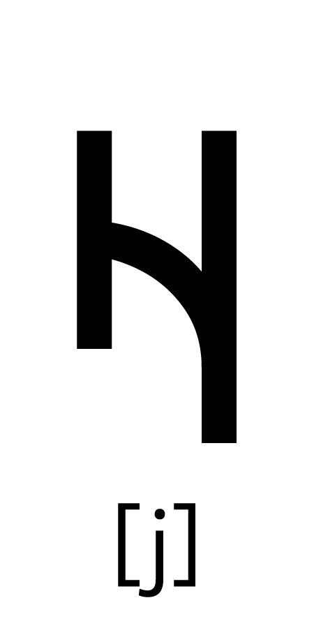
Gätuhil was designed as a featural system, in which the shapes and relations of the letters hint at how they are pronounced. All the letters with descenders are voiced consonants, letters with ascenders are voicless consonants, and letters that have neither are vowels. Additionally, consonant pairs with the same place and manor of articulation (ex. [k] & [g]) have strokes that reference each other.
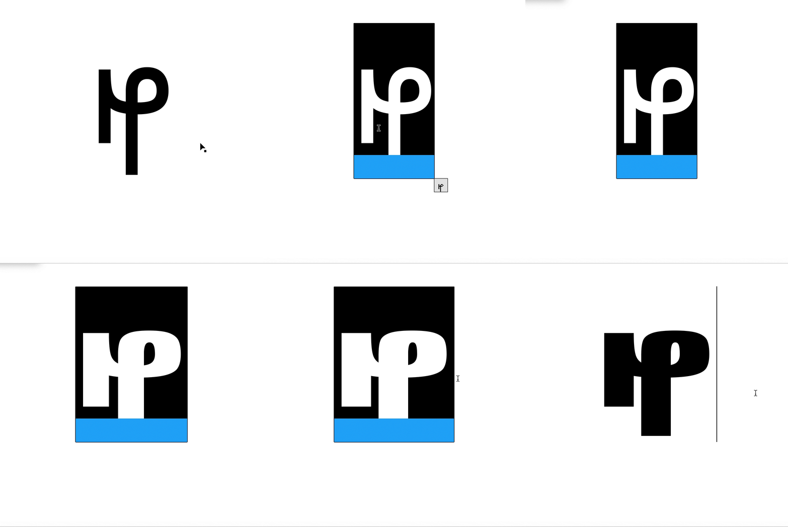
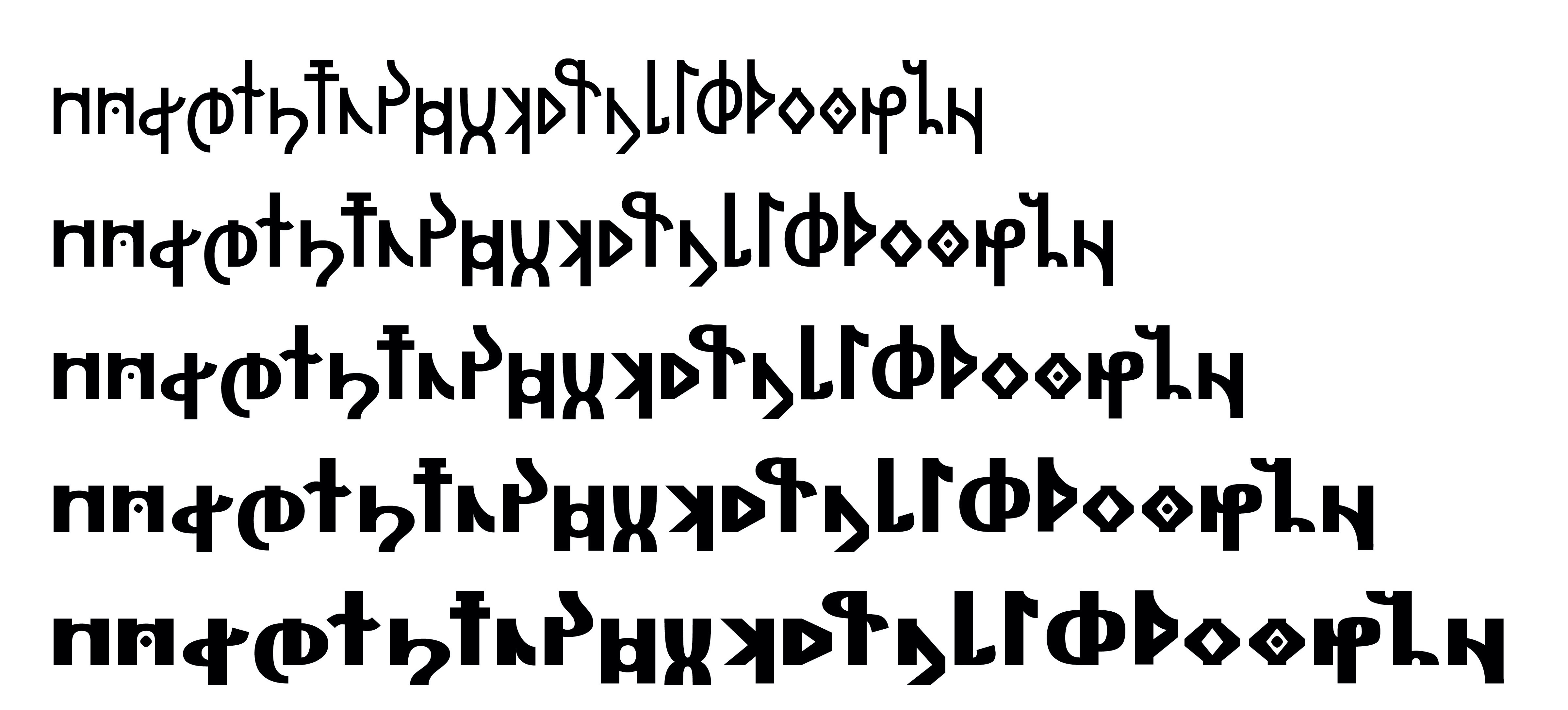
The final typeface of Gätuhil Sans is a Variable Font, ranging from a Regular weight to a Black/Heavy weight. Stylistic alternates were also added, with a full set of pixel type, a handful of calligraphic versions, and a couple serifed glyphs.

